.svg)
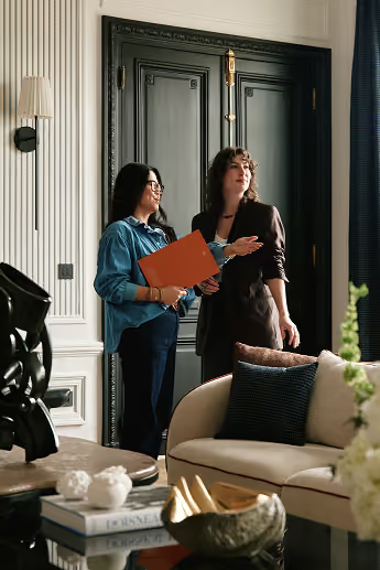


How can you bring color into your home?
The saying "to each their own" has never been more fitting than when choosing the palette that will elevate your interior. Color gives a room a very specific atmosphere and reflects your personality, even when it is absent. Introducing color, whether in subtle touches or bold splashes, helps organize space and reveal the sometimes hidden assets of your property. While fun, selecting the right shades requires a bit of thought, which we suggest supplementing with expert advice from the architects at Maison Kyka studio.
Why incorporate color into your interior design?
Beyond aesthetics: what does color bring us?
For Maison Kyka, color is never a neutral decorative choice: it is a language. While omnipresent in most cultures, it takes on meanings and symbolism that vary greatly, such as red, which represents passion, prosperity, or purity depending on whether you are in the West, China, or India. It is therefore not surprising that on an individual level, our relationship with color is subjective and even physiological.
The perception of color involves the eyes and the brain, and depends on photoreceptor cells called cones, which are sensitive to light wavelengths. Several studies have even shown a difference in perception between men and women, with women generally better at distinguishing colors. These disparities are certainly subtle, but they further deepen our very personal connection to color.
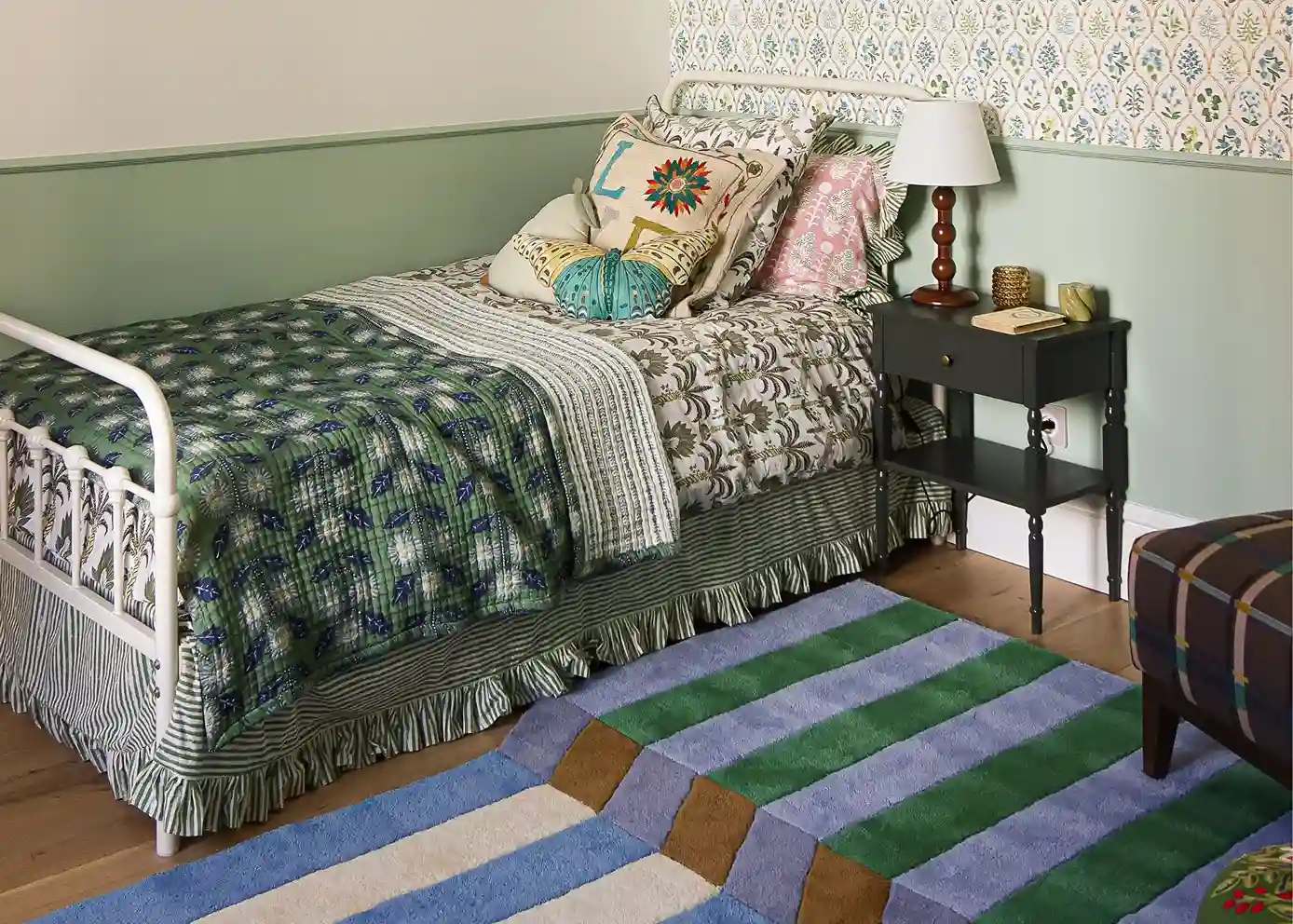
What's more, it influences our emotions and moods, which is why it is so important to select shades that suit your personality and lifestyle when renovating your property. Energizing and warm, orange tones instill good humor and optimism, while khaki and brown provide a sense of security. If you are naturally anxious and have trouble sleeping, enveloping and soothing colors like dusty pink or velvety blue are ideal for your bedroom. Those who tend to feel the cold and prefer staying in will find comfort in an environment with warm, pigmented colors like mustard yellow and terracotta. Going against the grain of the noticeable sterilization of our interiors, where vibrant colors are gradually giving way to classic clinical gray and white, Maison Kyka works with a bold, colorful aesthetic.
An essential vector for well-being, color is an integral part of the personalization process for every project. Our architects focus as much on the spirit of the space being transformed as on the psychology and vision of the owners to create a property that truly reflects them.
Choosing a color for your interior: a personal decision
When it comes to the colors you want to incorporate into your home, we advise you to listen to your own instincts above all else. Trend books and other sources of inspiration are certainly welcome to broaden your horizons, but they can also distract you from your own timeless and unique vision in favor of fleeting fads. And although, theoretically, there are no hard and fast rules—since the property you are designing is, first and foremost, yours—there are some practical tips to ensure a successful color harmony.
First, use a color wheel. This tool displays colors according to a spectrum based on the decomposition of natural light. This spectrum organizes the colors visible to the human eye into primary and secondary, warm and cool shades. The color wheel is, of course, just a starting point, as each color then has hundreds of shades with varying levels of saturation and brightness. Three types of combinations can create color harmony:
- amonochromatic harmony, which plays with variations of the same color: light, dark, saturated, or desaturated tones,
- ananalogous harmony combines three colors that are adjacent on the color wheel,
- acomplementary harmony which, as the name suggests, is based on combining colors that are opposite each other on the color wheel, particularly warm and cool colors.
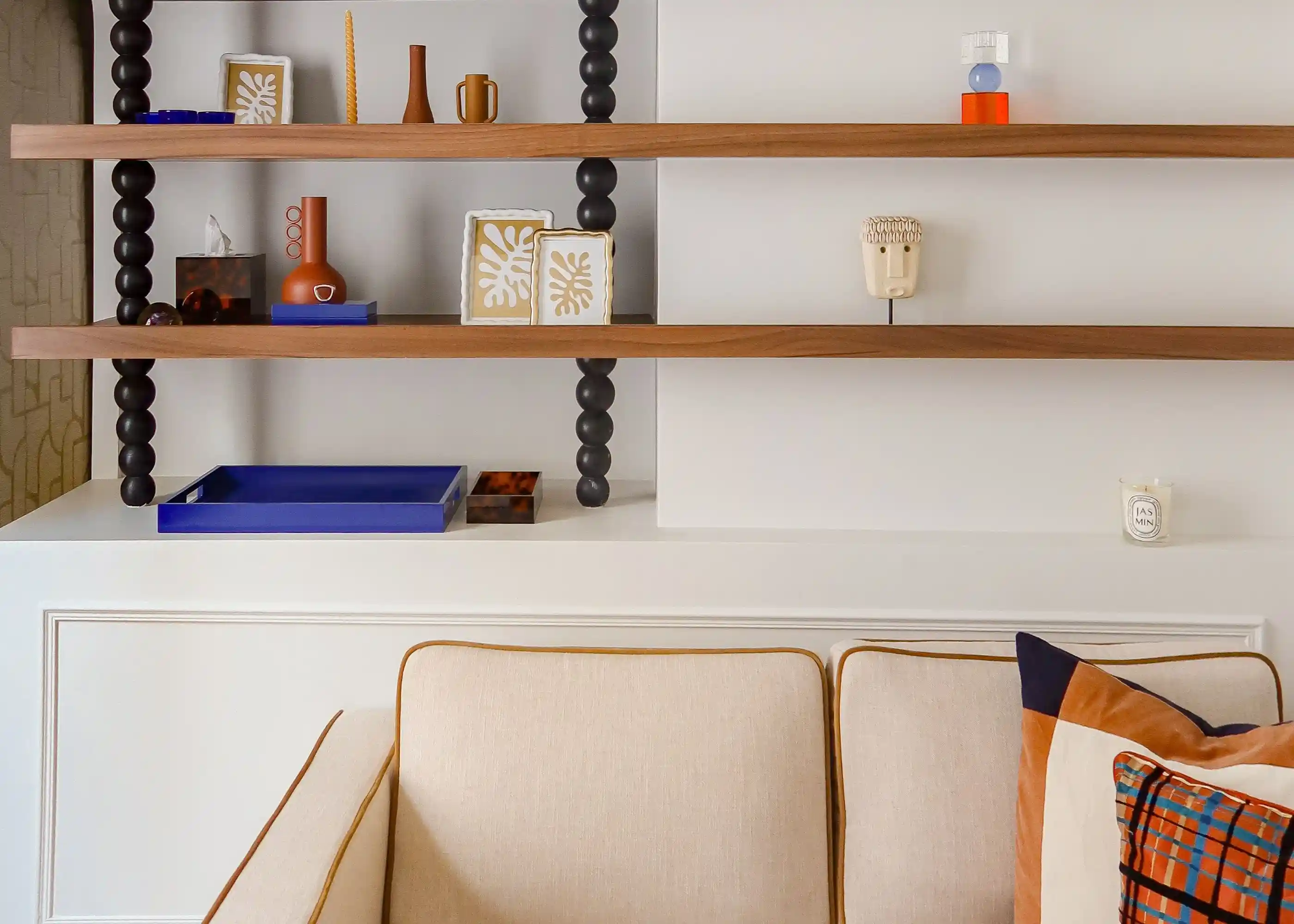
The balance between the different colors selected depends primarily on their proportions. If you are trying this for the first time in your home, we suggest limiting yourself to three colors using the following distribution:
- 60% of a dominant color, which serves as the visual thread and sets the overall tone of the space,
- 30% of an intermediate shade,
- 10% of an accent color,
- to which you can add neutral tones like white or black.
If, after this introduction, you are still not convinced about bringing color into your future home, don't worry—there are a thousand and one ways to enhance a room with neutral tones like beige and white. Instead of using bland or overly uniform shades, Maison Kyka invites you to look toward off-white, a warm cream, or textured grays like anthracite and greige. Our studio's interior designers are also by your side throughout the design of your renovation project, helping you embrace the bold choices you’ve dreamed of for your future property.
“Bertille, the interior designer, was able to respect our tastes and propose a restoration and decor that we absolutely loved.” Danièle Bonnet
Using paint to color your spaces
What factors should you consider before painting a wall?
Painting walls is the most effective way to add a splash of color to your home. A few coats are enough to transform the character of a room, and while hiring a professional is highly recommended for a flawless finish, this remains one of the most accessible DIY projects, even for those who aren't expert painters.
The wall must first be prepared to receive the paint, especially when using intense colors, as they will highlight any imperfections once dry. After carefully cleaning the wall of dust, paint marks, or other residue, ensure that any cracks are filled, the surface is perfectly smooth, and a primer (or a tinted undercoat) has been applied.
Beyond the color itself, the type of paint is the key factor that will ensure optimal durability and a finish that meets your expectations. For interiors, the preferred choice isacrylicpaint, as opposed to oil-based. It is fluid, easy to apply, does not release polluting solvents, and does not require tedious tool cleanup.
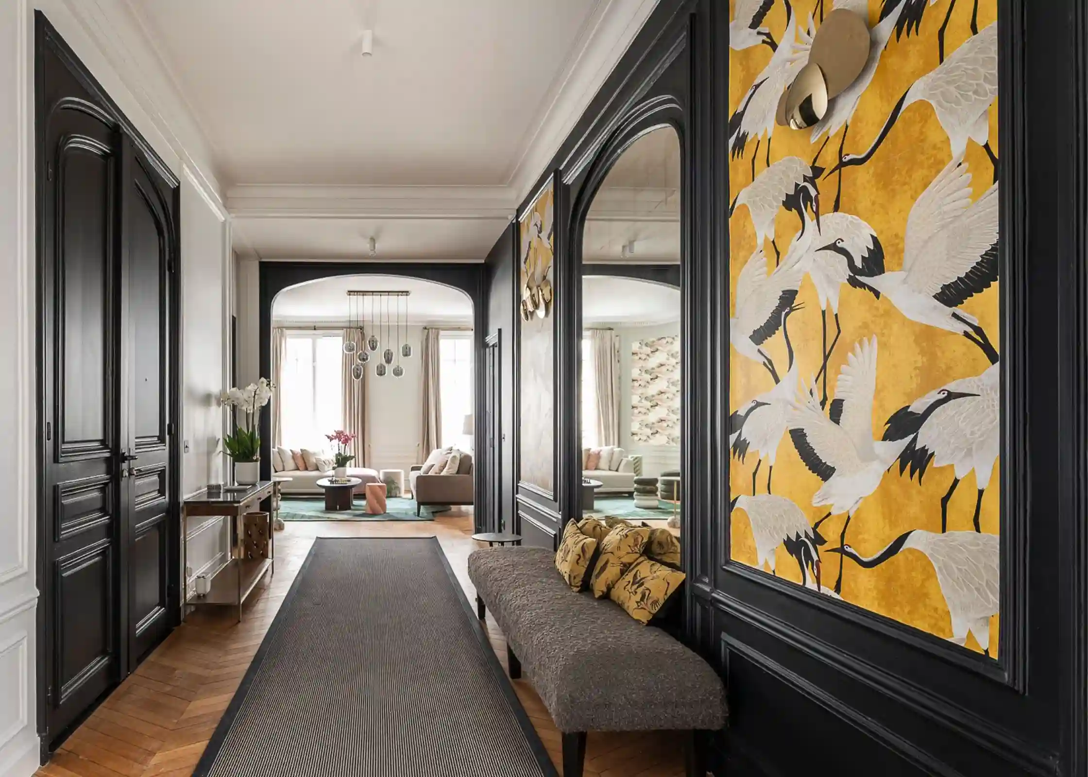
There are five types of paint, which should be selected based on the desired aesthetic and the room being decorated:
1. Matte paint. It absorbs light and adds depth to dark shades. Its chalky appearance creates a cozy and elegant atmosphere, making it a very trendy choice favored for renovations. However, it is not suitable for every room or lifestyle. Use it to add color to a ceiling, or to decorate a bedroom or living room. Avoid using it in a bathroom, kitchen, or on doors. Because it is delicate, this paint is sensitive to humidity and condensation, and is not washable, making it prone to marks and splashes.
2. Velvet paint. An excellent alternative to matte paint, velvet paint is an ultra-versatile solution suitable for all rooms, including hallways and children's bedrooms. Its partial light absorption helps hide most surface irregularities while creating a very subtle sheen, especially with darker shades. Be mindful of maintenance, however, as it is generally not washable.
3. Satin paint. It is the ideal ally for dark rooms, thanks to its warm finish and its ability to reflect even the slightest ray of light, regardless of the shade chosen. Resistant to impacts, dirt, and humidity, it is highly recommended for damp areas like bathrooms, kitchens, and toilets. However, a satin finish is more likely to highlight surface imperfections, which should be carefully prepared before applying the paint.
4. Gloss paintFor a vibrant, luxurious finish, opt for gloss paint. Beyond brightening up walls and furniture, it subtly highlights often-overlooked details like moldings or chair rails. Add to that its high durability, and this paint guarantees a long-lasting color that won't fade, even with repeated washing.
5. Lacquer paintAt the far end of the gloss spectrum is lacquer paint, which offers a near-mirror finish that intensifies light through its reflections. Best suited for smaller, flawless surfaces, it is also ideal for damp rooms and floors. Lacquer paint is the most durable option over time and stands up perfectly to scrubbing.
Paint is no longer the only way to bring color to your walls. Wallpaper, currently enjoying a major revival, is making a striking comeback in our homes. It captivates with its rich patterns, textures, and the unique character it brings to a room—a staple for the Maison Kyka studio, which has made it one of its aesthetic signatures.
Playing with patterns and room layout
Painting a wall a solid color is far from the only way to introduce color into a room. Certain well-chosen areas are enough to transform the atmosphere of a space while maintaining its balance. Painting a wainscot, for example, visually structures a room with elegance, while an accent wall, a niche, or even the ceiling adds depth and character. Architectural elements like exposed beams, door frames, or baseboards also offer great opportunities to introduce color in small doses. For the more daring, painted patterns, stylized arches, or colorful built-in furniture round out this palette of decorative options without ever overwhelming the space.
Optimizing space with color
More than just a decorative element, color allows you to rethink volumes, reveal a room's potential, or, conversely, soften its flaws. The"box effect,"a solid color applied uniformly across walls, ceilings, doors, and other architectural features, creates a very cozy, enveloping feeling—ideal for a bathroom or a hallway. A vibrant color can energize a narrow, dark room, while a deeper shade can help rebalance a ceiling that is too high or a hallway that feels endless.
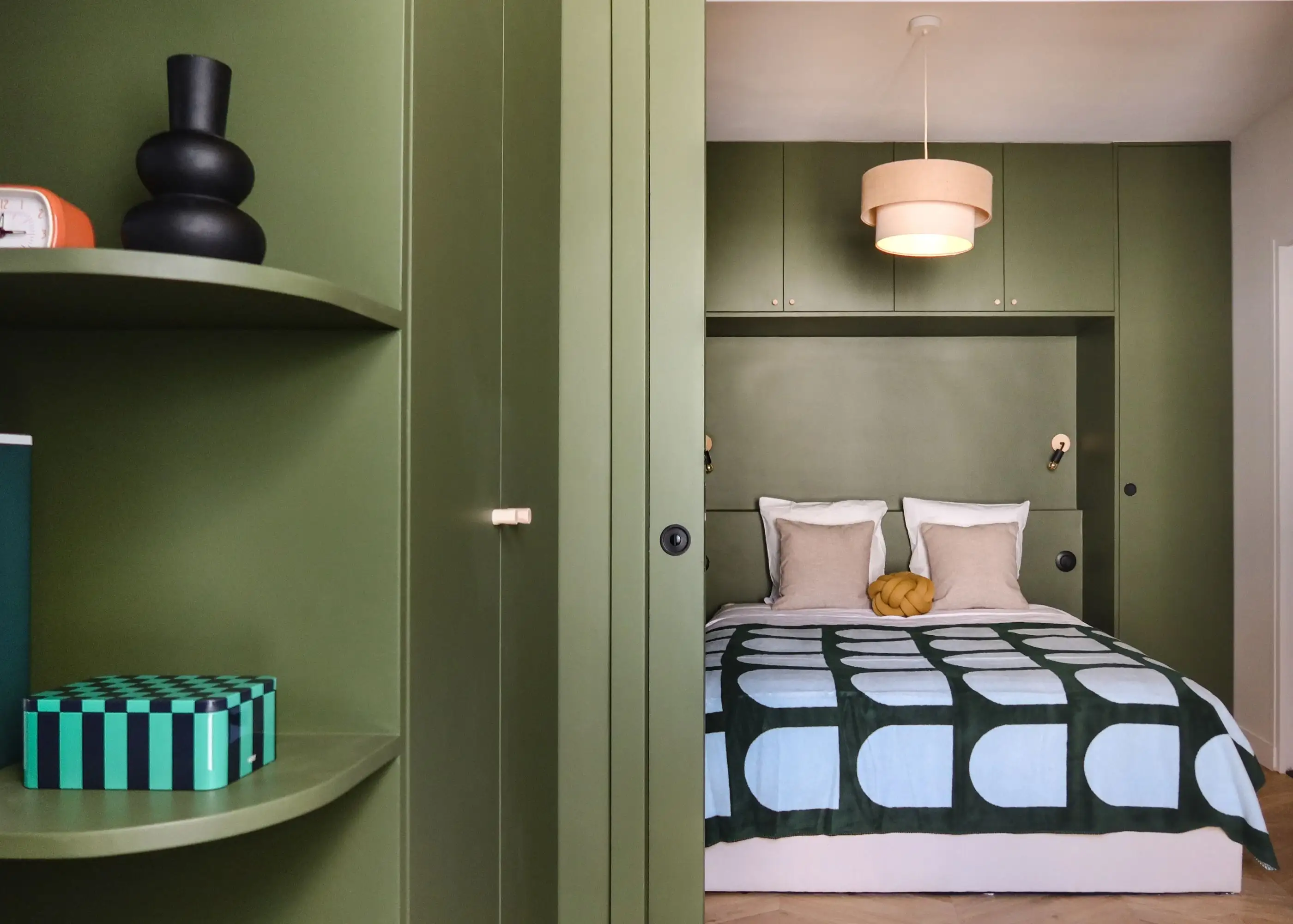
Color can even define a specific area where a partition would otherwise reduce the available space. This is an interesting solution for open-plan properties like lofts and small apartments, where every square meter counts. Anton and his 27 m² attic studio is a perfect example of optimizing a challenging space through color. The kitchen, adjacent to the sloped ceiling, stands out in the living area thanks to a monochrome block of color, reinforced by a black backsplash with a glossy finish. It becomes the centerpiece of the graphic, contemporary world of this ultra-functional apartment nestled in the heart of Paris's 4th arrondissement.
When used wisely, color becomes a real asset for renovating your property. So, why not write your next project in color with Maison Kyka?
Introducing color beyond the walls
Extending color to every room
While walls are the primary ambassadors of color in an interior, they are by no means the only surfaces that can be adorned with it. The kitchen, the bathroom or the restroom are increasingly embracing bold palettes. Far from the cold, uniform aesthetic that long dominated these spaces, we now see vibrant, assertive hues flourishing, creating an effect that is as decorative as it is structural.
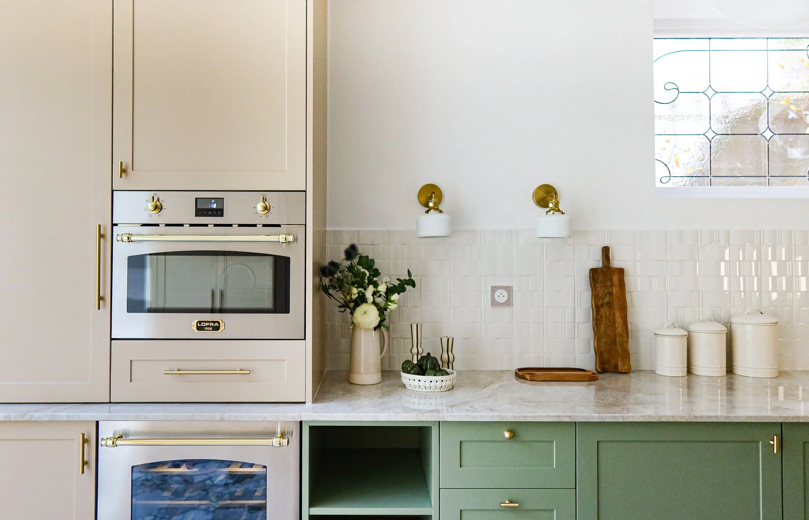
In the kitchen, a living space in its own right, cabinet fronts are adorned with deep or vibrant colors, from petrol blue to sage green, or even a very trendy matte brick red. Wall tiles also become a canvas for expression: colorful zellige tiles, graphic patterned earthenware, or pigmented backsplashes bring life to the clean lines of a functional layout.
In the bathroom, color makes a statement here too: on the tiles, faucets or even basins, often chosen in powdery or mineral tones. As for the powder room, it completely breaks free from neutral conventions: painting the walls and ceilings a deep, rich color, or opting for a designer colored toilet like the models from the brand Trone, adds a real touch of whimsy and transforms this transitional space into an aesthetic capsule.
Play with colorful furniture and decorative objects
Introducing color here and there is an equally effective way to liven up an interior while leaving room for your tastes to evolve. Furniture, everyday objects , and textiles offer endless possibilities for adjusting the mood without undertaking major renovations.
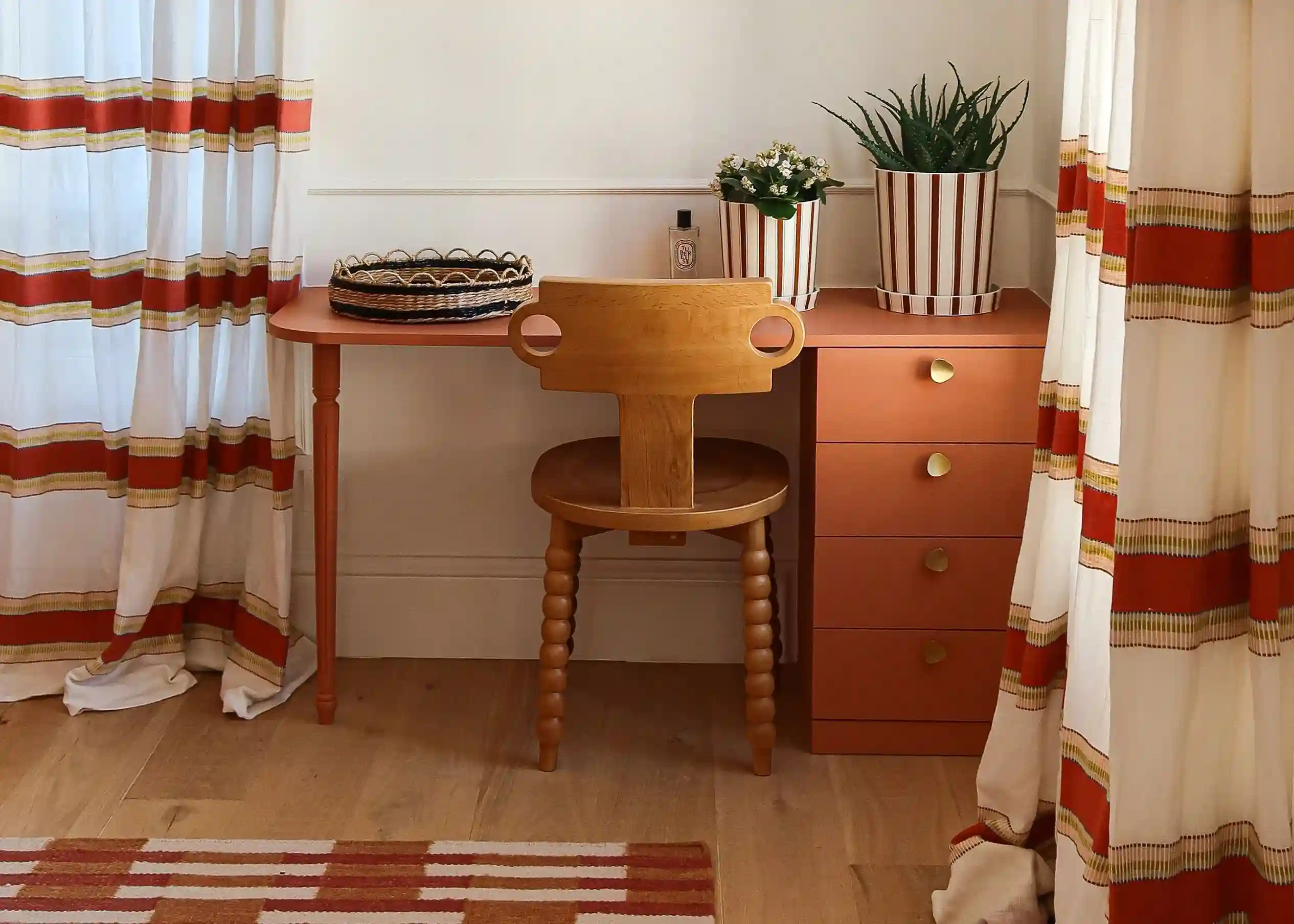
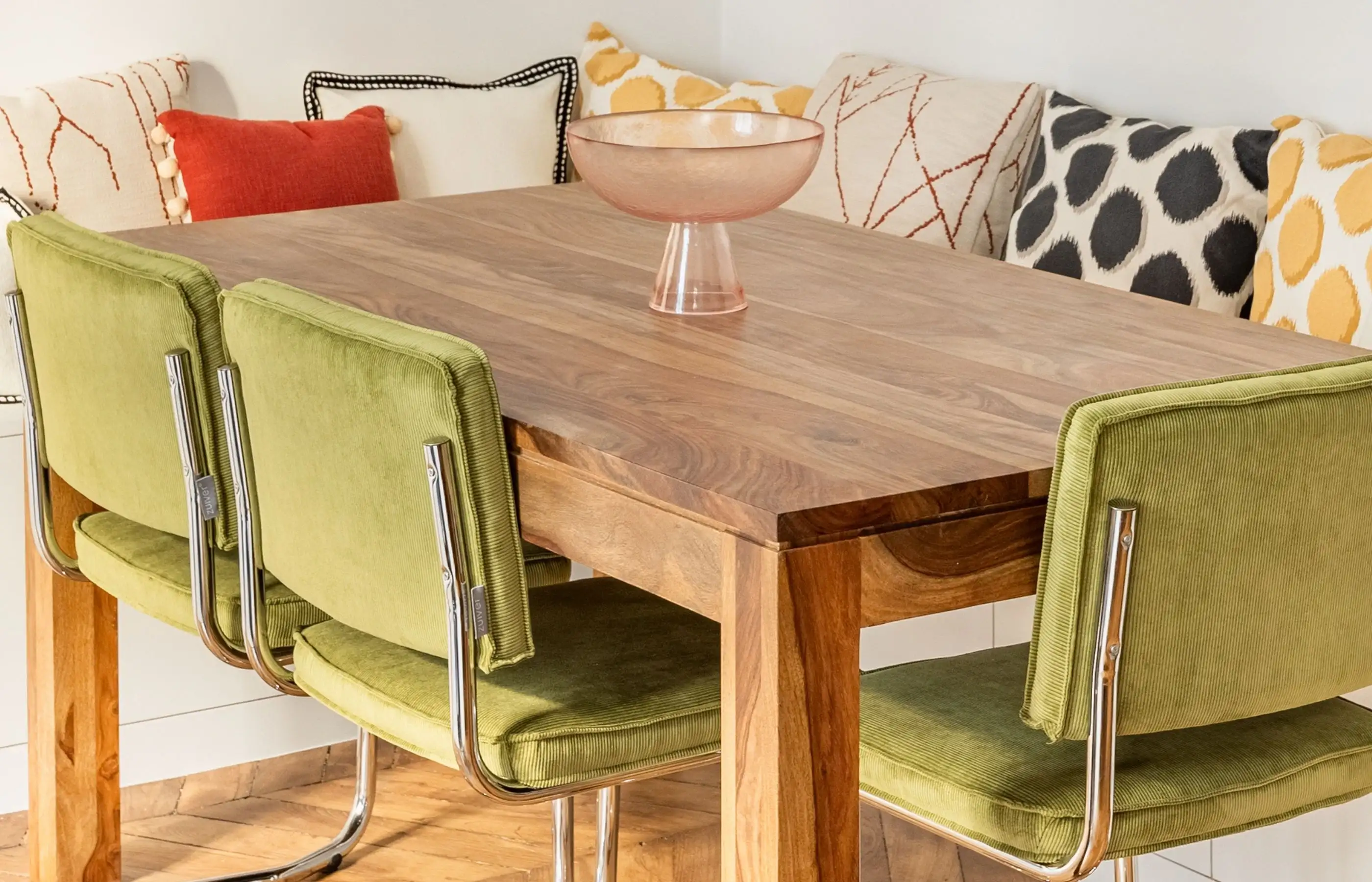
A saffron yellow armchair, a midnight blue bookcase, a graphic rug, or a poppy red side table all become focal points that add rhythm to the room. Scouring for vintage furniture and objects is a great way to stand out from the crowd. In addition to being sustainable, this approach allows you to acquire decorative accessories that are often unique and in colors sometimes impossible to find in current brands. Bed linens, curtains, cushions, and throws also provide a colorful softness that is easy to refresh with the seasons. Even tableware—dishes, glasses, placemats, and tablecloths—can be an opportunity to bring contrast, warmth, or character to a dining room or open kitchen.
These splashes of color, though scattered, tell a cohesive story: that of a space designed down to the smallest detail, vibrant, elegant, and deeply personal. It is also through these elements that Maison Kyka translates its clients' desires into sensitive and unique worlds.

.svg)